Project overview
A familiar brand,adapted for everyday grocery shopping.
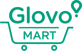
Glovo Nigeria was moving its supermarket offer from “Glovo Bargain Supermarket” to Glovo Mart, and there was no existing logo to inherit — the previous name had never been given one.
The work was not to reinvent Glovo. It was to extend a brand people already recognised into a clearer grocery proposition, and to write down the rules that would keep it consistent once other people started using it.
Challenge
Create something recognisably new for Glovo Mart while keeping it unmistakably Glovo — working inside an established global brand system rather than from a blank page.
Contribution
- Sub-brand identity direction
- MART lockup and cart device
- Colourway and background rules
- Holding-shape logic
- Brand guidelines document
Delivered
- Master lockup artwork
- Four defined colourways
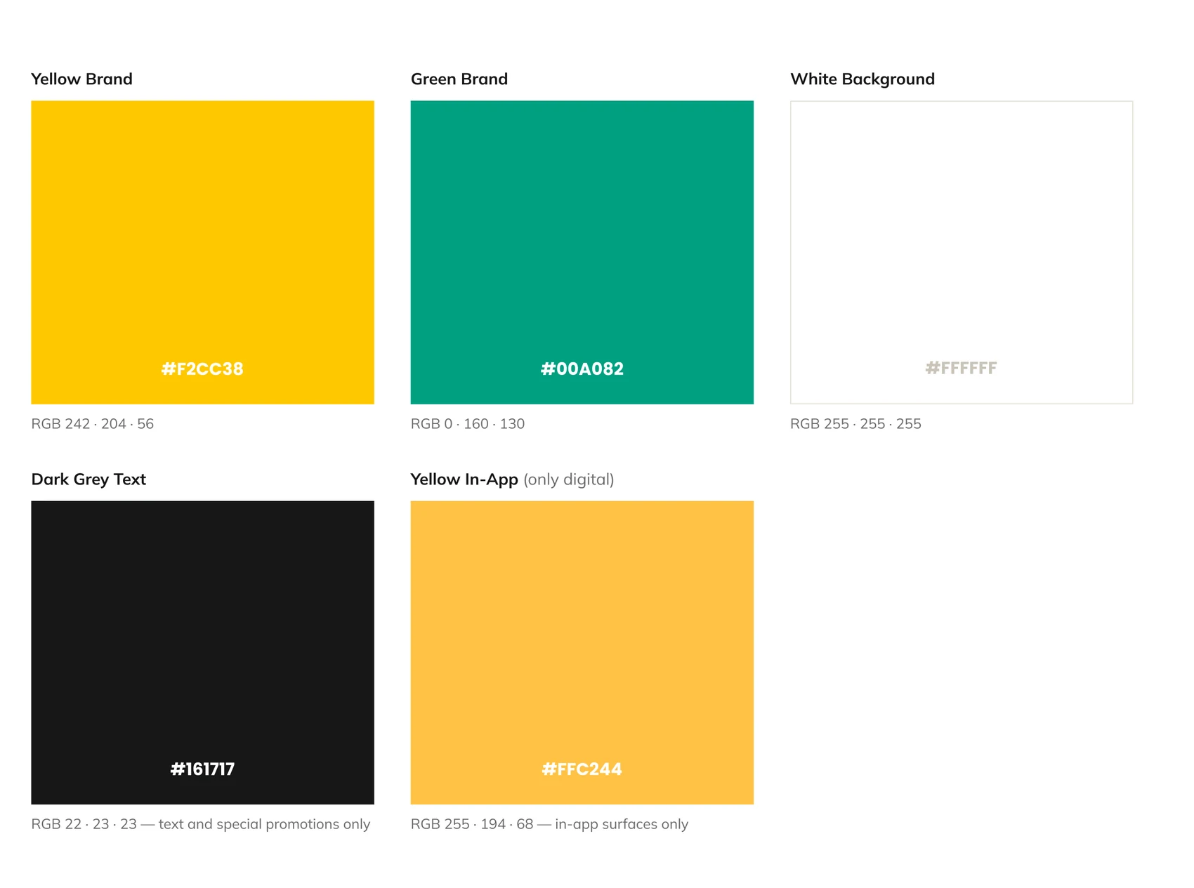
- Five-colour palette with usage rules
- Dominance and proportion rules
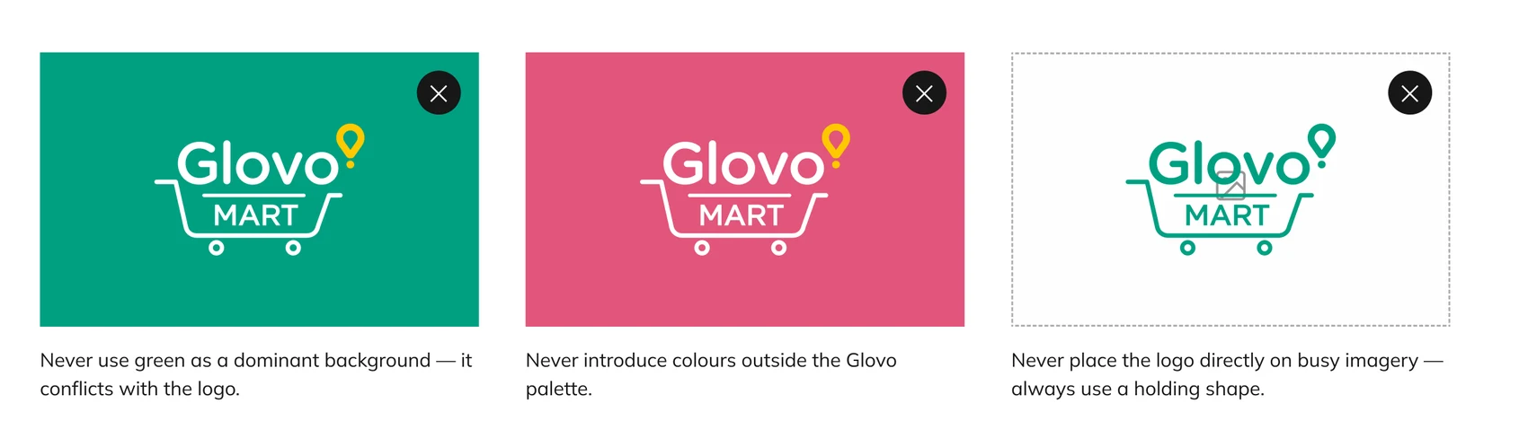
- Do / Don't governance
- Retail application direction
Design challenge
Glovo first.Grocery immediately after.
The brand had to read as Glovo before it read as anything else. That ruled out a new mark, a new palette, or a wordmark of its own.
What it needed instead was a device: something that said supermarket at a glance and could sit with the existing wordmark and isotype without competing with them. The cart became that device, with MART set inside it so the two always travel together as one piece of artwork.
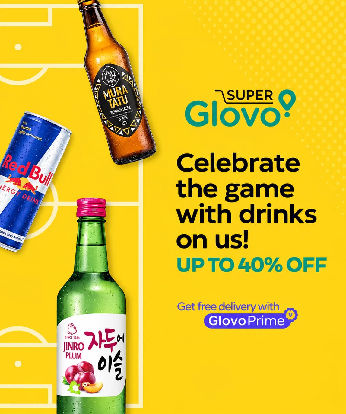
Kenya's Super Glovo was shared as category precedent early on — useful as a reference for how far the identity could stretch, not as a template to follow.
Identity system
Familiar at first glance.Distinct where it matters.
One identity.Multiple retail touchpoints.

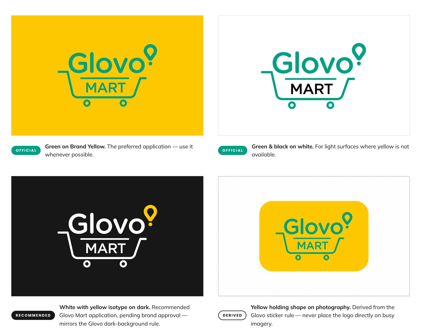
- OfficialGreen on Brand Yellow
- OfficialGreen & black on white
- RecommendedWhite with yellow isotype on darkPending brand approval
- DerivedYellow holding shape on photographyFrom the Glovo sticker rule
Retail applications
Designed to live beyond the logo.
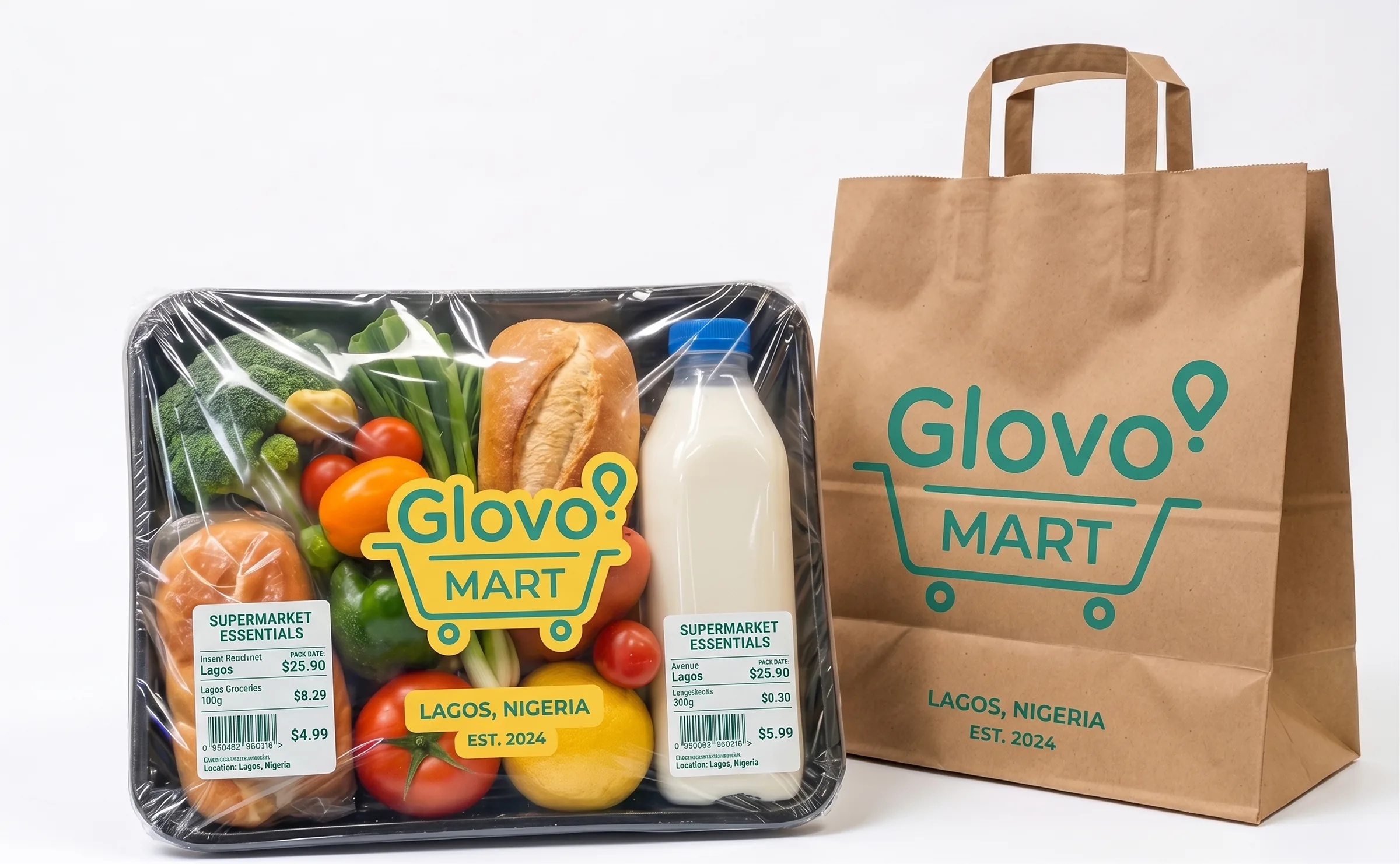
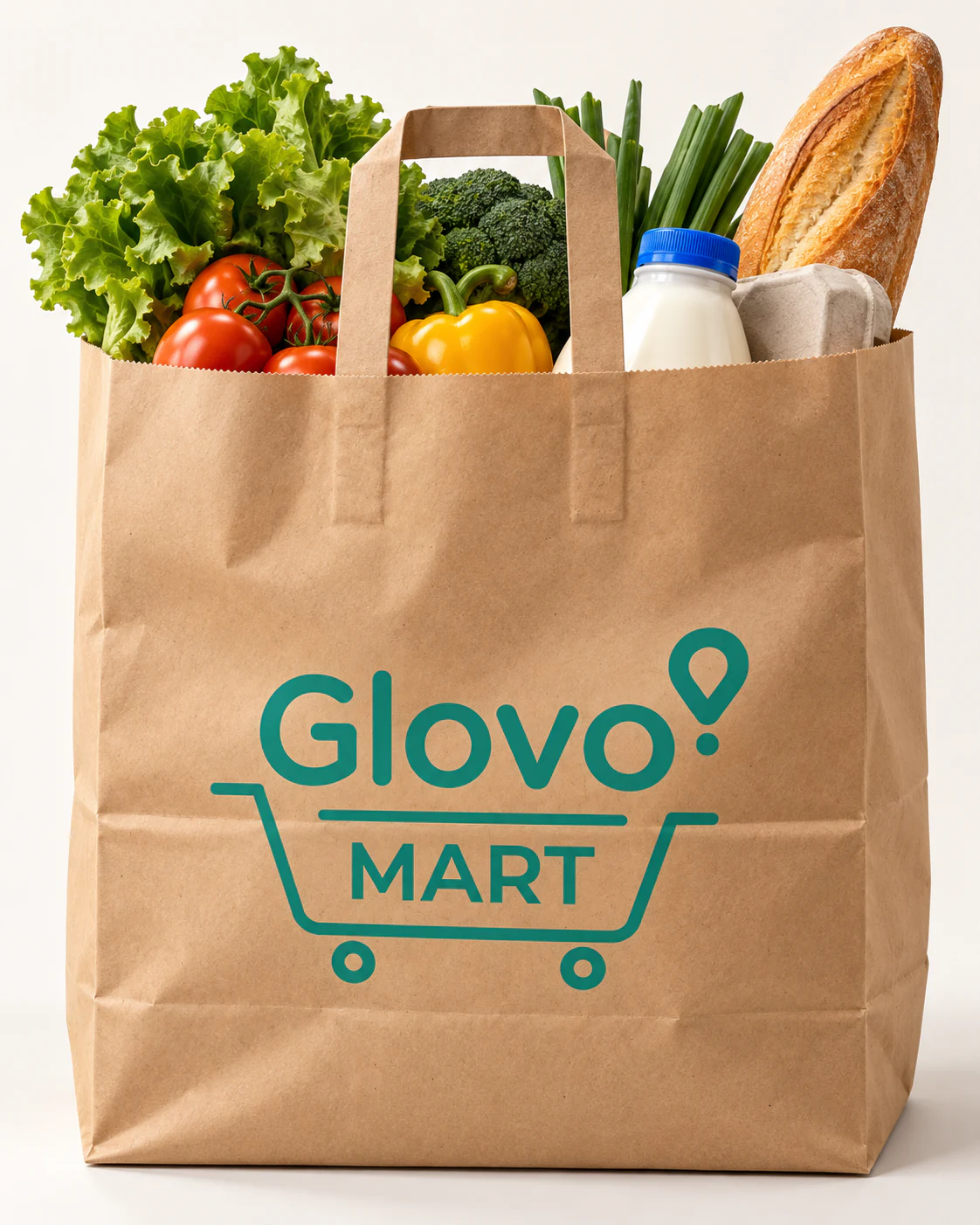
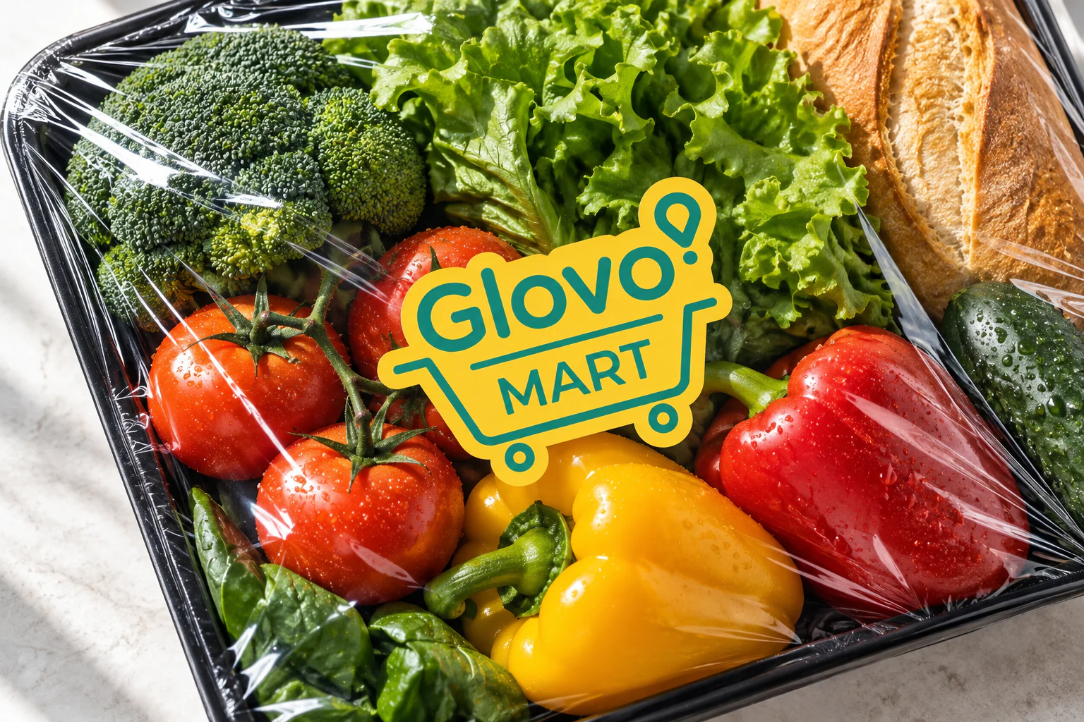
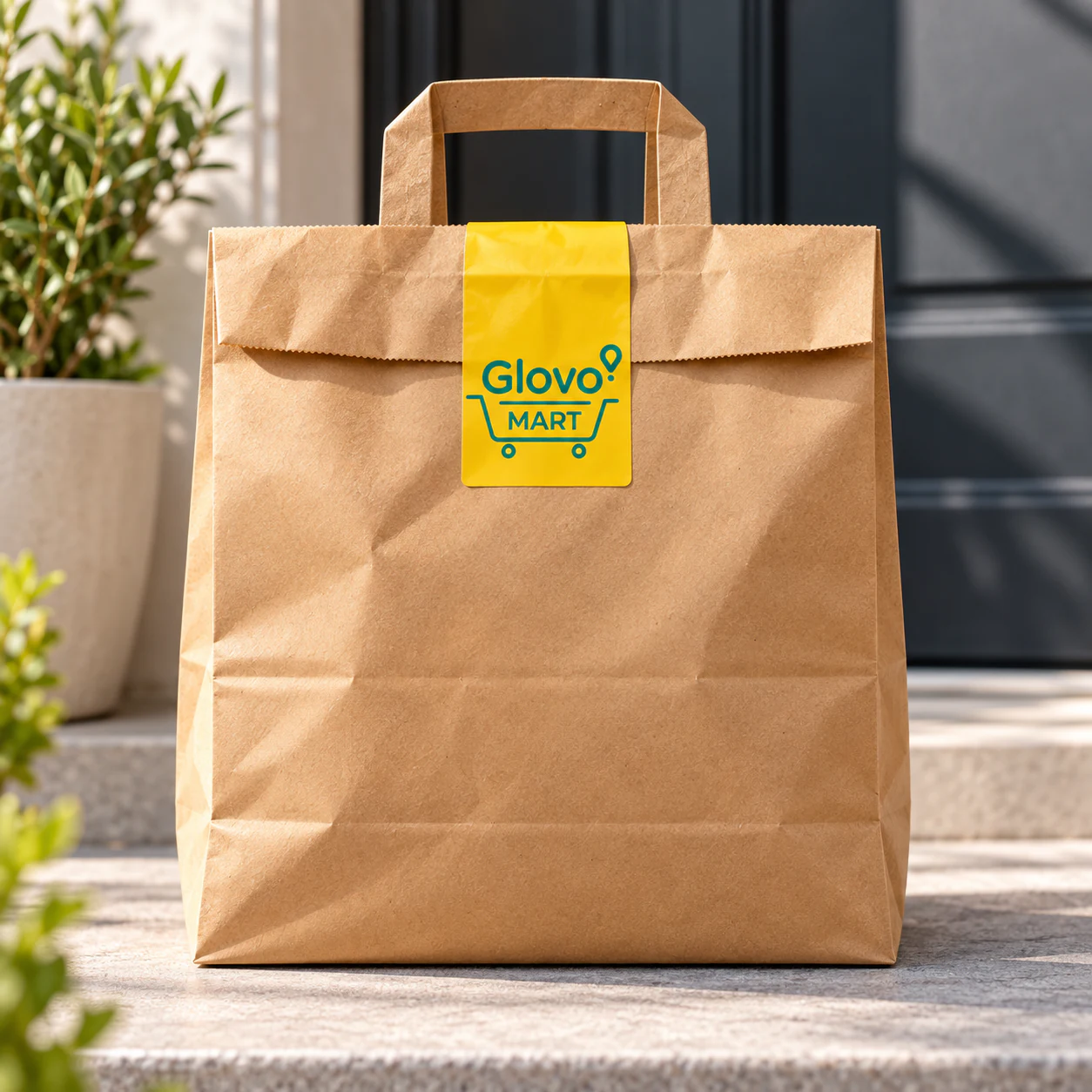
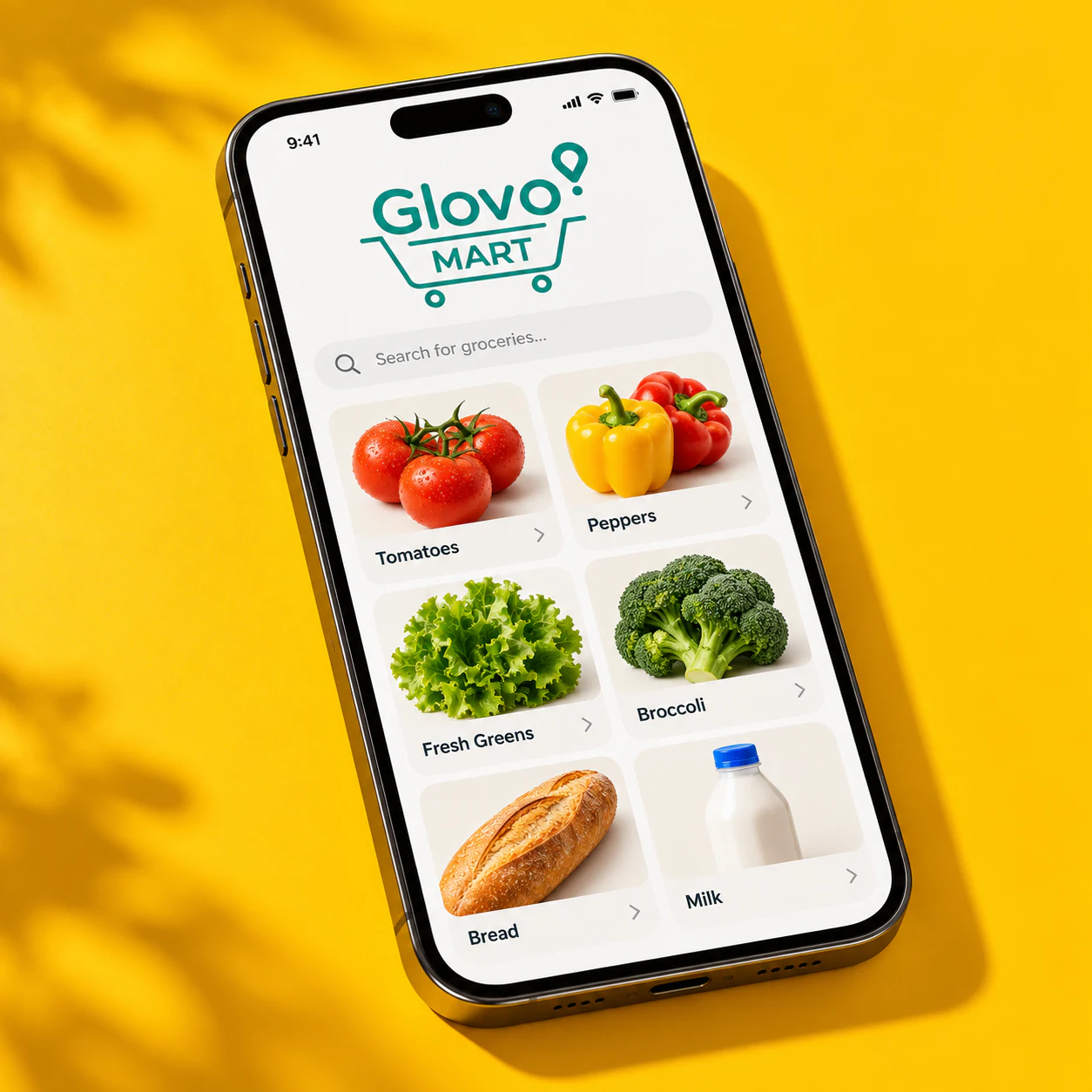
A supermarket identity is judged on packaging before it is judged on a logo sheet. The lockup was built to survive being printed small on kraft, wrapped around a tray, and seen at arm's length in a delivery bag.
Yellow carries the recognition at distance; the cart device does the work up close.
Presentation mockups, not in-market production.
One familiar brand.A clearer retail proposition.
The value here was restraint. Everything that made Glovo recognisable stayed exactly where it was, and the only new element — a cart holding the MART name — was the one thing the brand did not already have a way to say.
Tobi FadareLead Creative DesignerBrand Identity · Sub-brand Architecture · Visual Governance